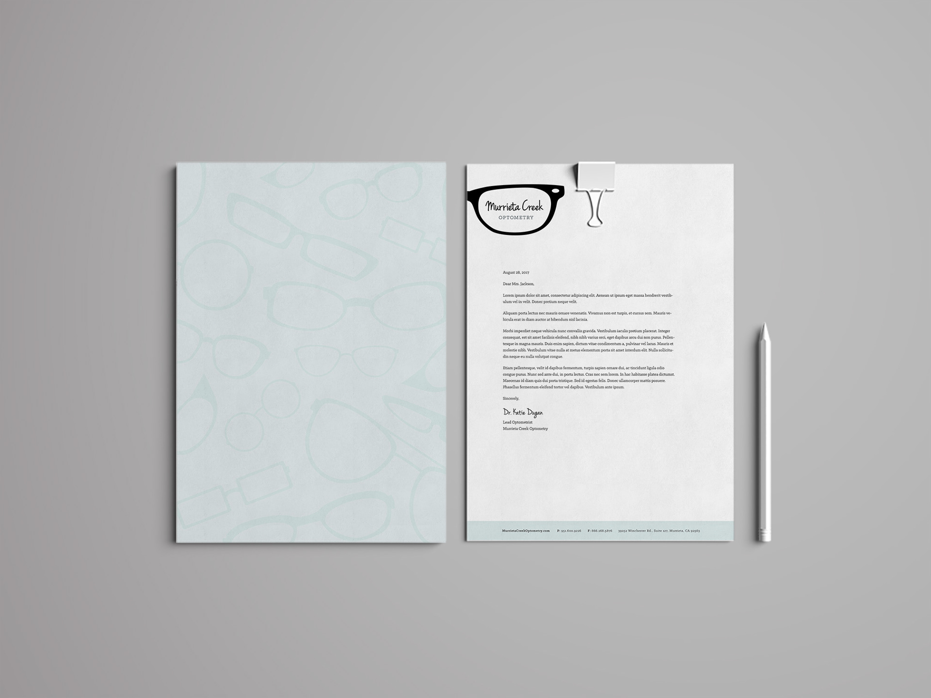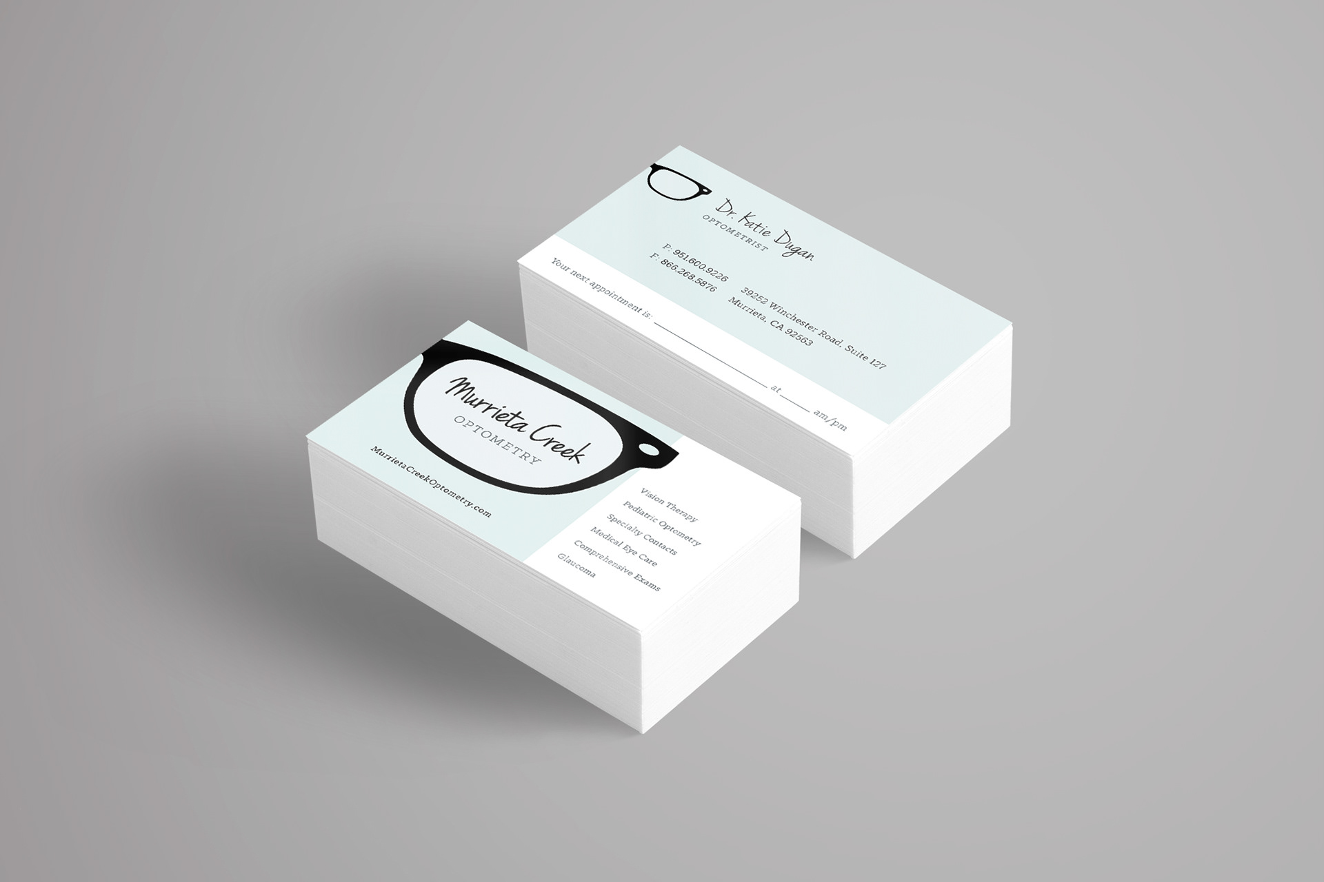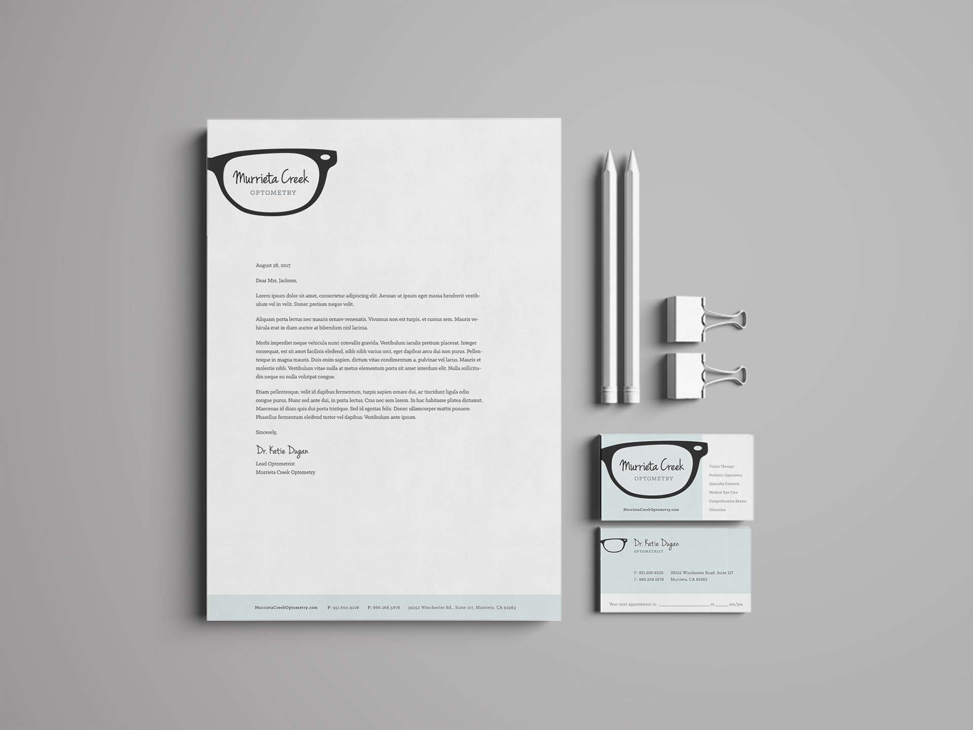

Background: A local optometry office needed new branding to use for their business cards and stationery.
Challenge: The ask was that it feel friendly, fresh and a bit funky. They wanted something that would stand out for your typical, local optometry office branding (or lack thereof).
Solution: For both the logo and business cards, I selected a script that looks handwritten to create the sense that they’re friendly and not stodgy at all. The typography was balanced out by complementing the modern script with a classic slab serif (the same style as the eye charts). I used simplified frames in a variety of ways in their branding, both for custom tone-on-tone pattern and as a bold “frame” for the logo.