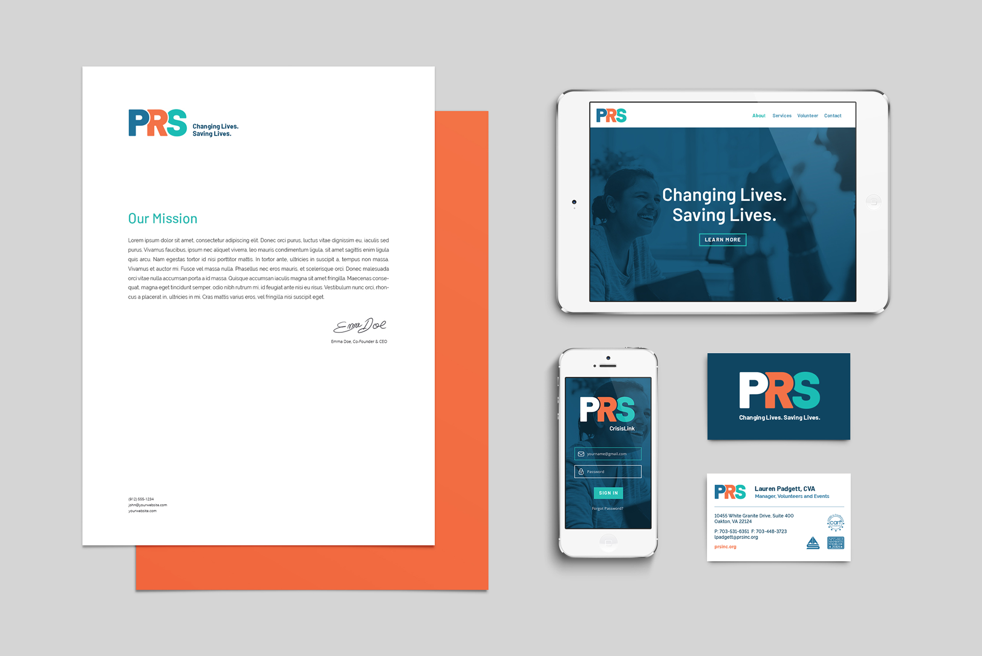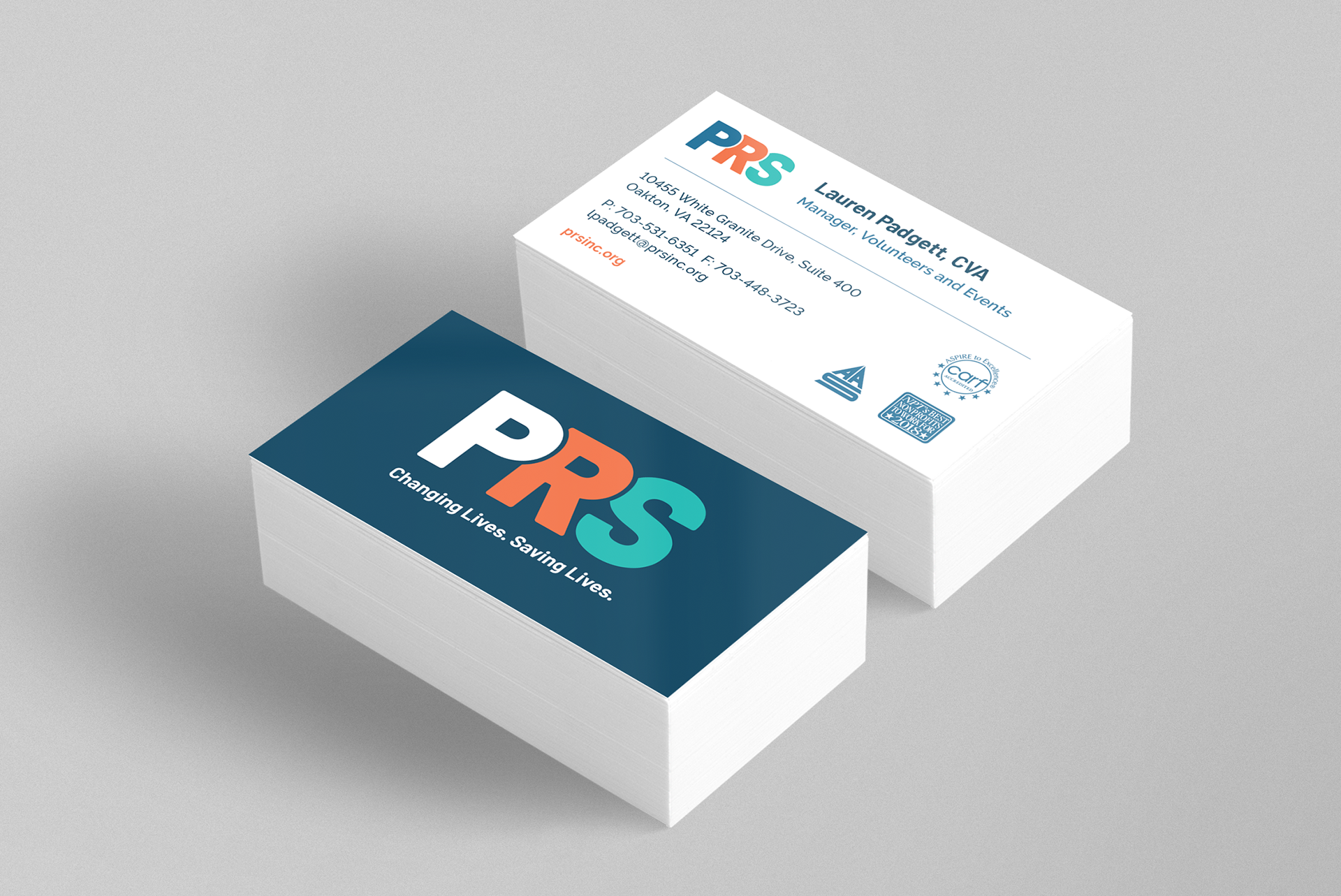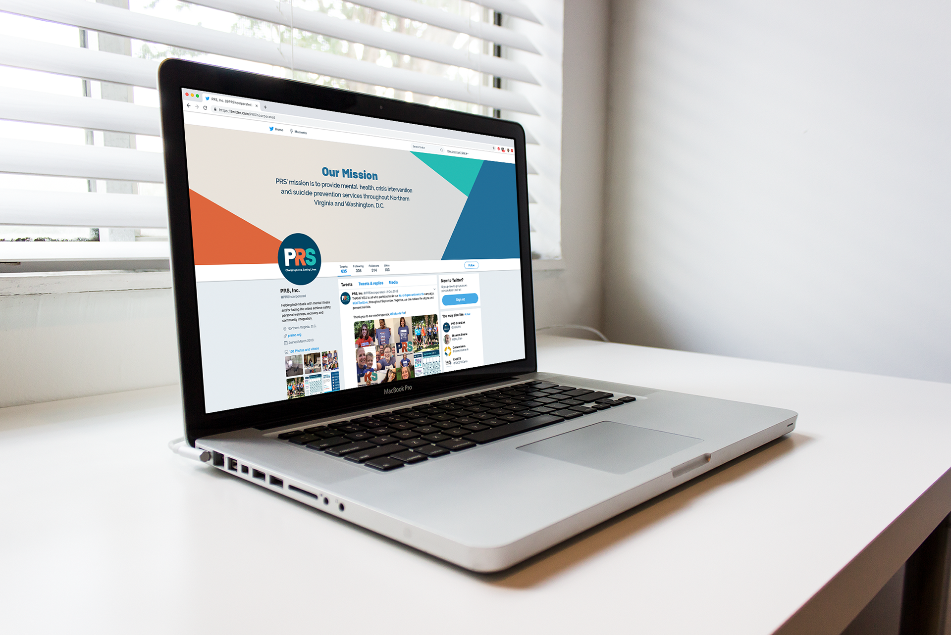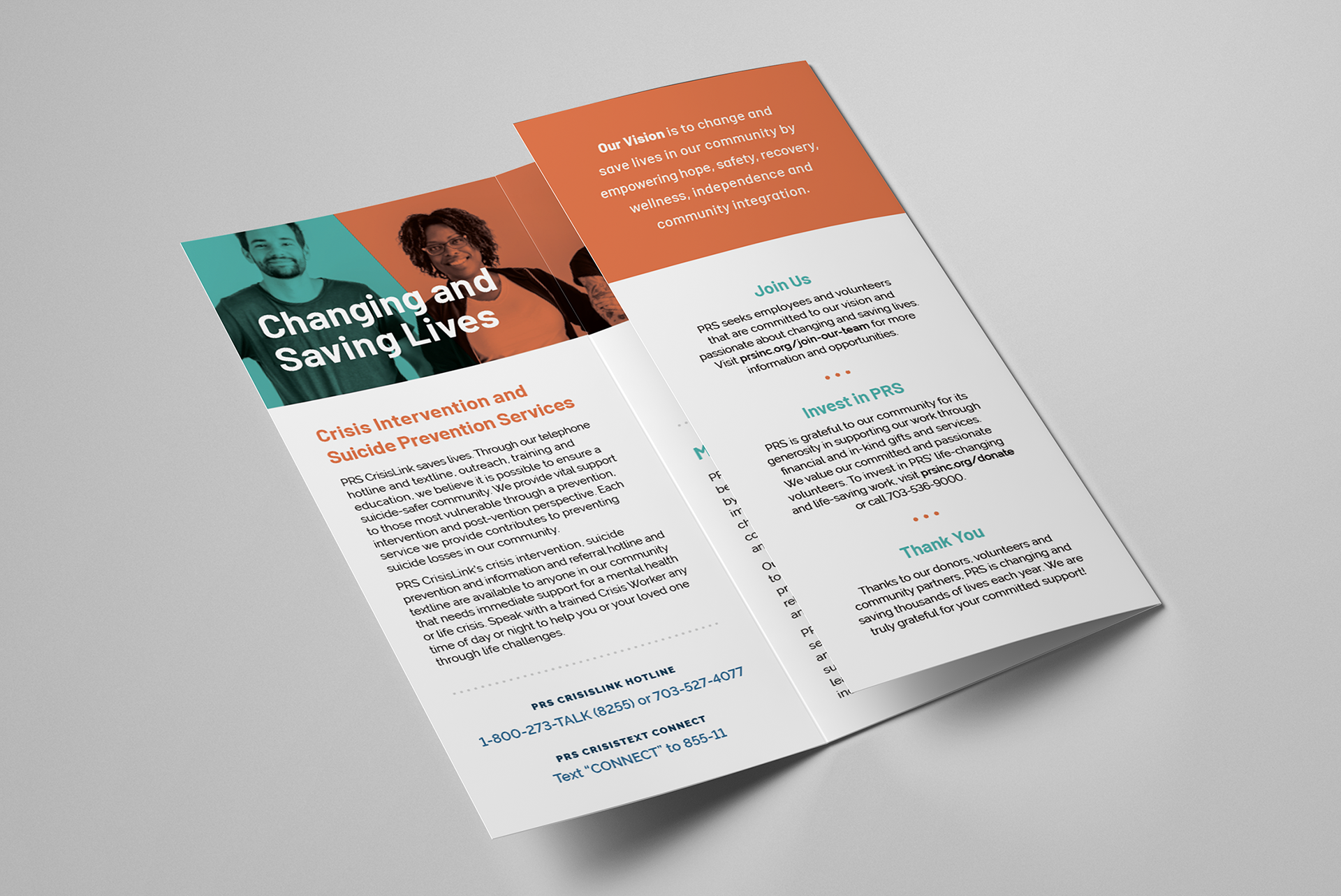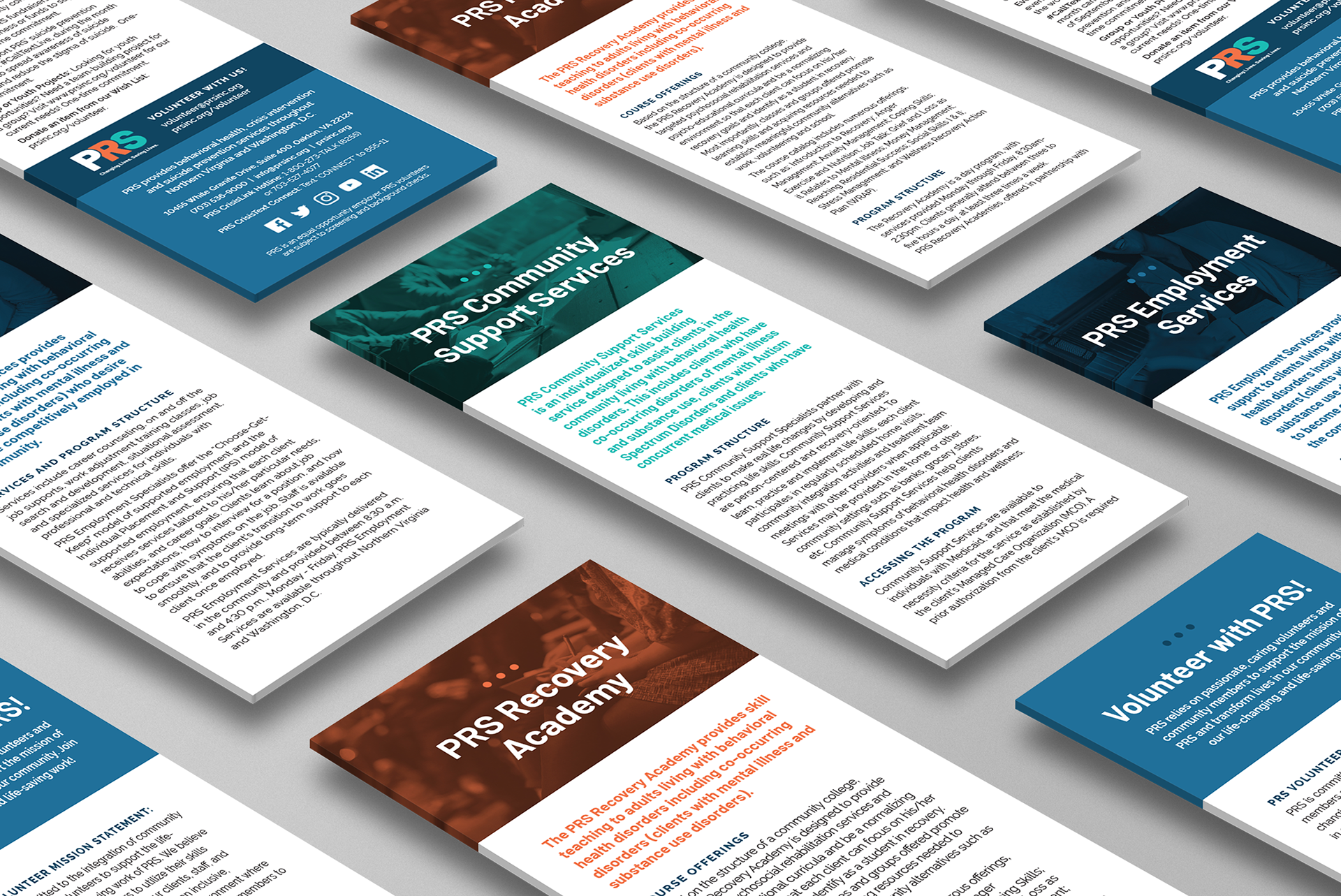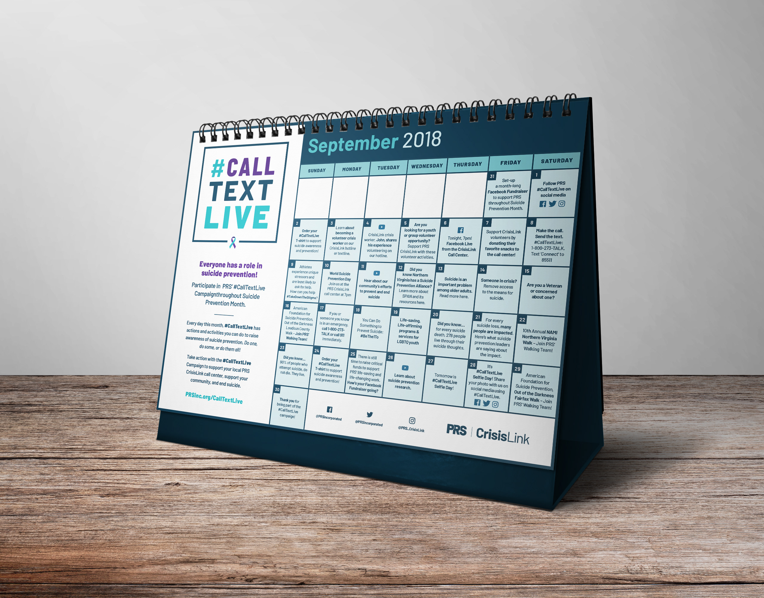
Background: PRS is a northern Virginia-based non-profit in the mental health sector. I took them through my custom brand discovery process to better understand and articulate their organization’s work, personality, audience, and the goals of the rebrand. After designing their logo, PRS asked me to bring their new branding to life, redesigning their stationary, brochures, social media presence and annual report.
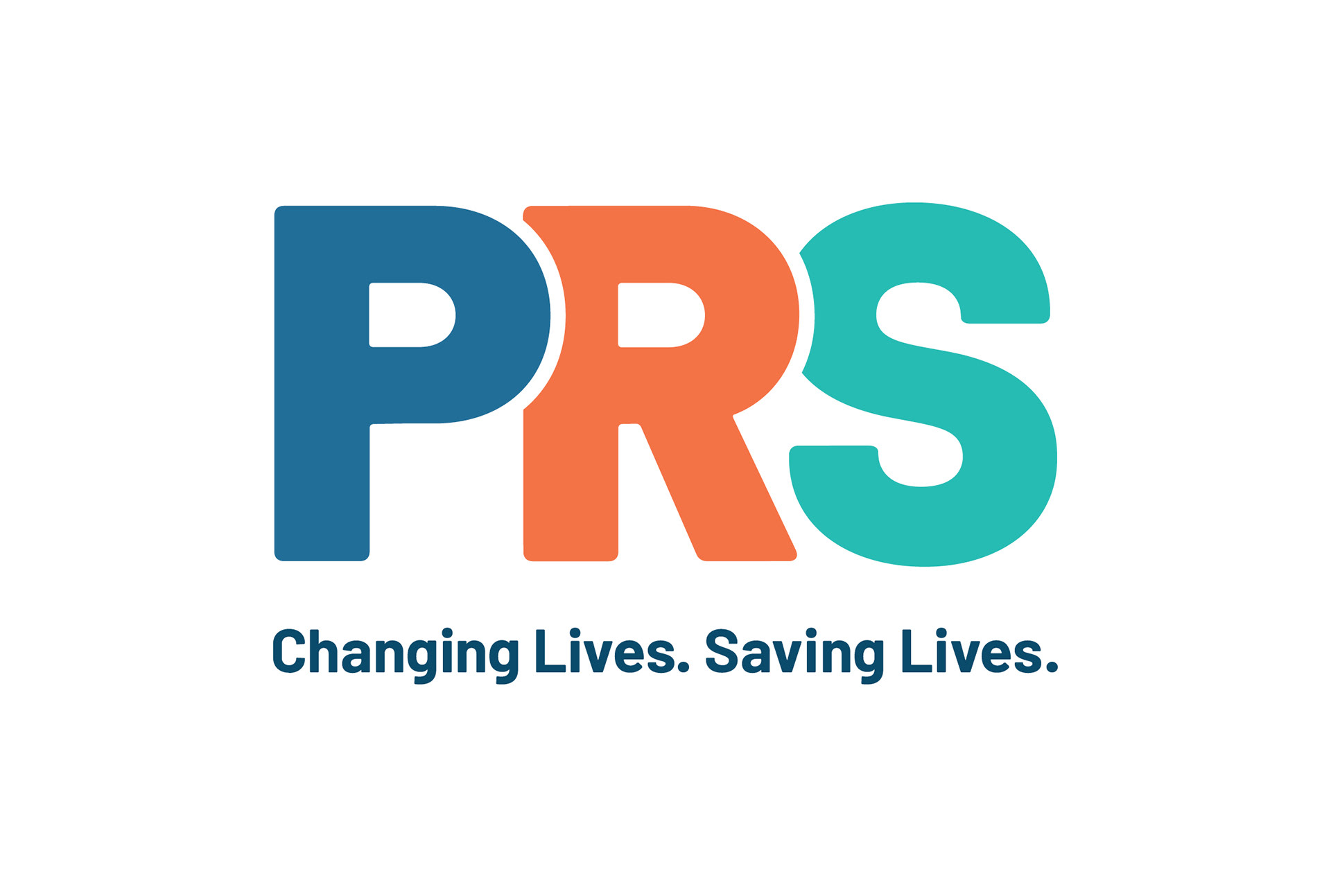
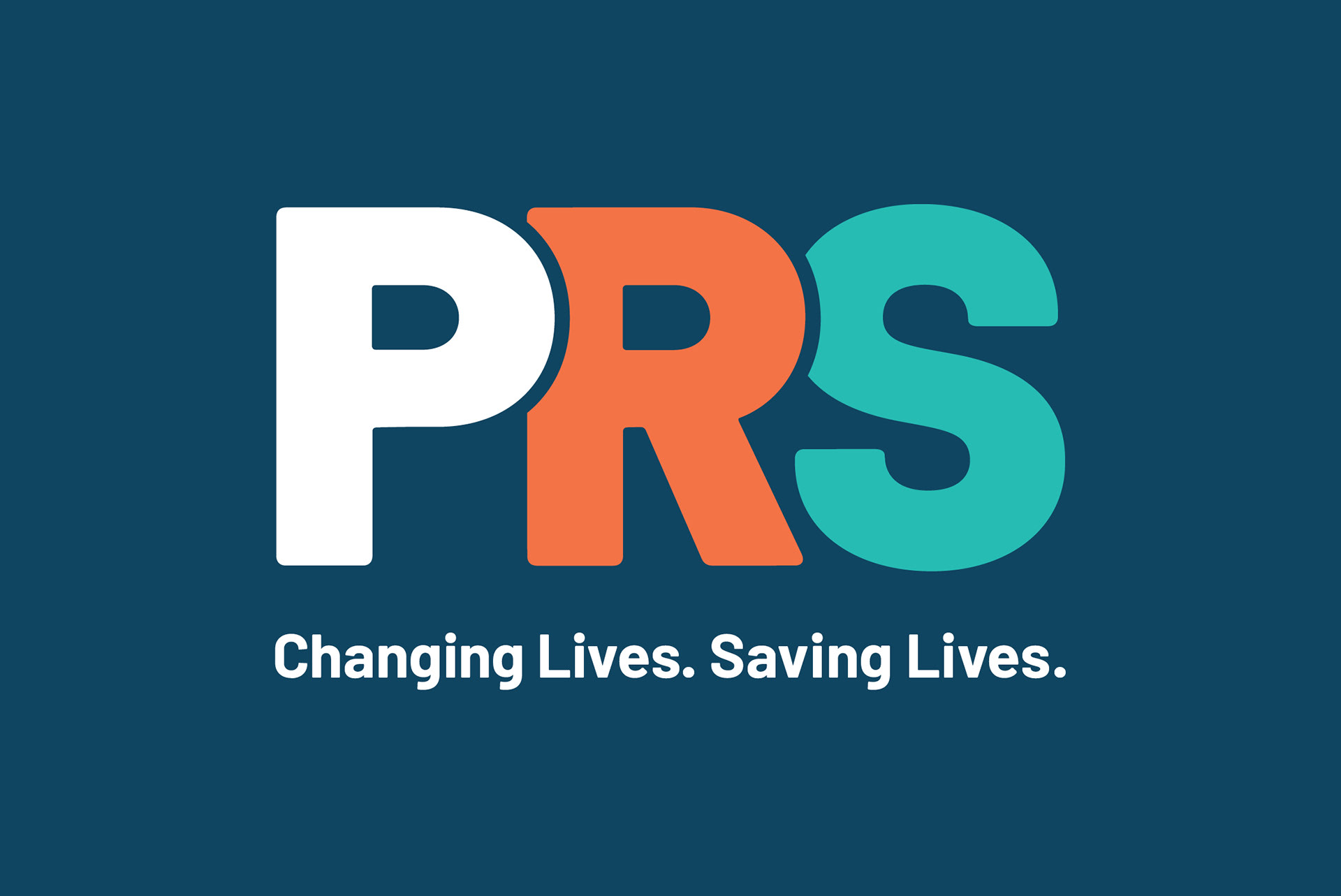
Challenge: PRS wanted a compelling, modern logo that was packed with meaning. PRS provides customized support through a whole range of programs and services. The challenge was to boil all that down into a simple mark that at the forefront, embodied hope and connection.
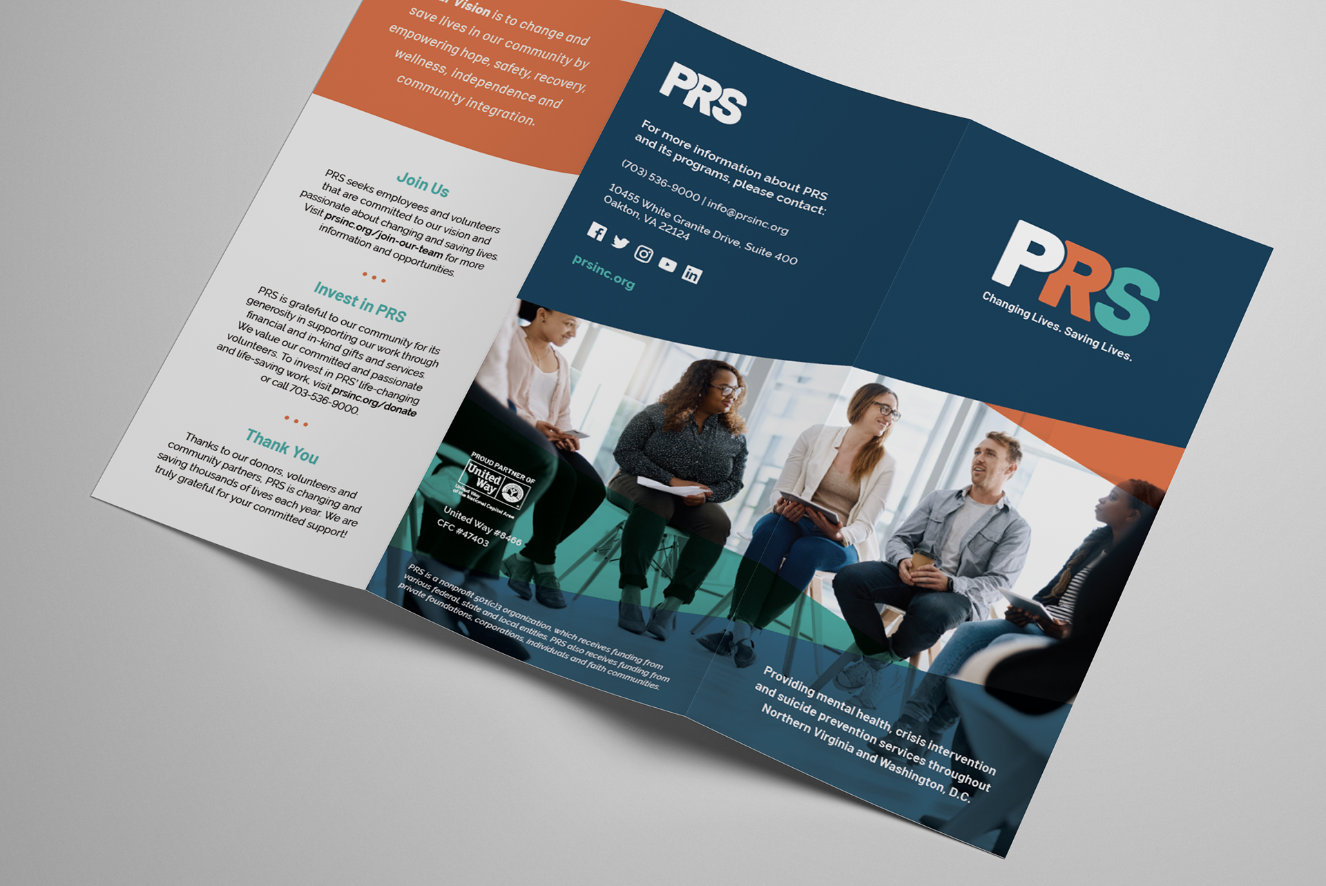
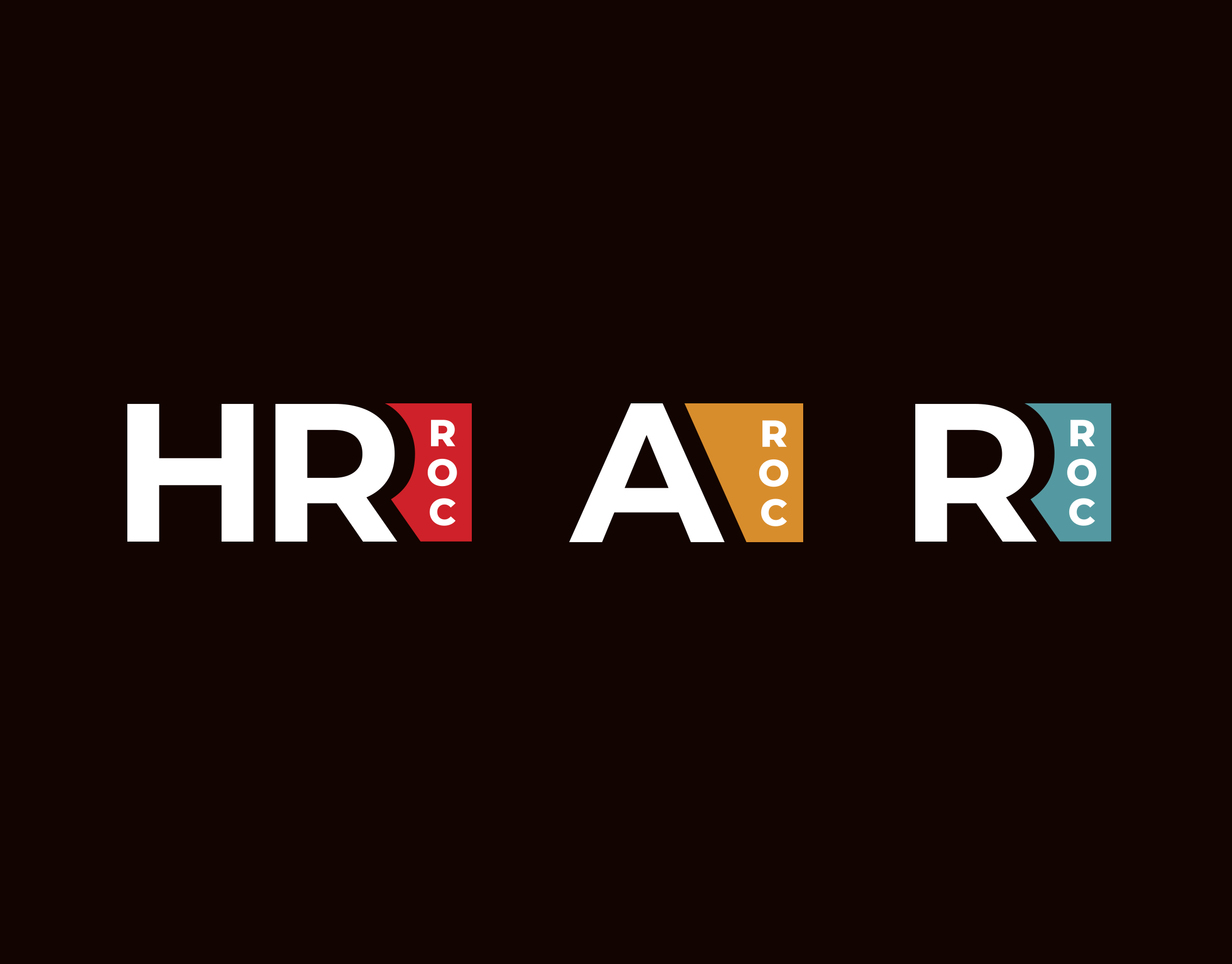
Solution: After exploring 3 very different concepts, we landed on an colorful, connected lettermark. The tri-color approach exudes warmth and hope, and hints at their individualized approach to caring for clients. The connected nature of the lettermark represents the end-goal of their work—individuals who are integrated into a larger community of support. Each letter fills in the missing section of the next, alluding to the programs and services that PRS offers, supporting individuals and their families during times of crisis or need.