
Background: Renovate America had reached a peak in their growth that turned out to be a tipping point. As marketers, they had previously focused primarily on their consumer-facing brand and had not yet had to flesh out their corporate identity. This was a huge opportunity to define the future of the brand and who they were becoming.
Challenge: As the company grew and needed to speak to investors and government leaders directly, a new identity was needed — fast. Some initial thinking was done around the brand promise, values and voice but for the most part, I was handed a blank slate and asked to put brand guidelines together for a brand that didn’t exist. There wasn’t time for a full branding exploration. The main goal at this point was for the brand to feel professional (not like a baby startup anymore), hopeful and to instill trust.
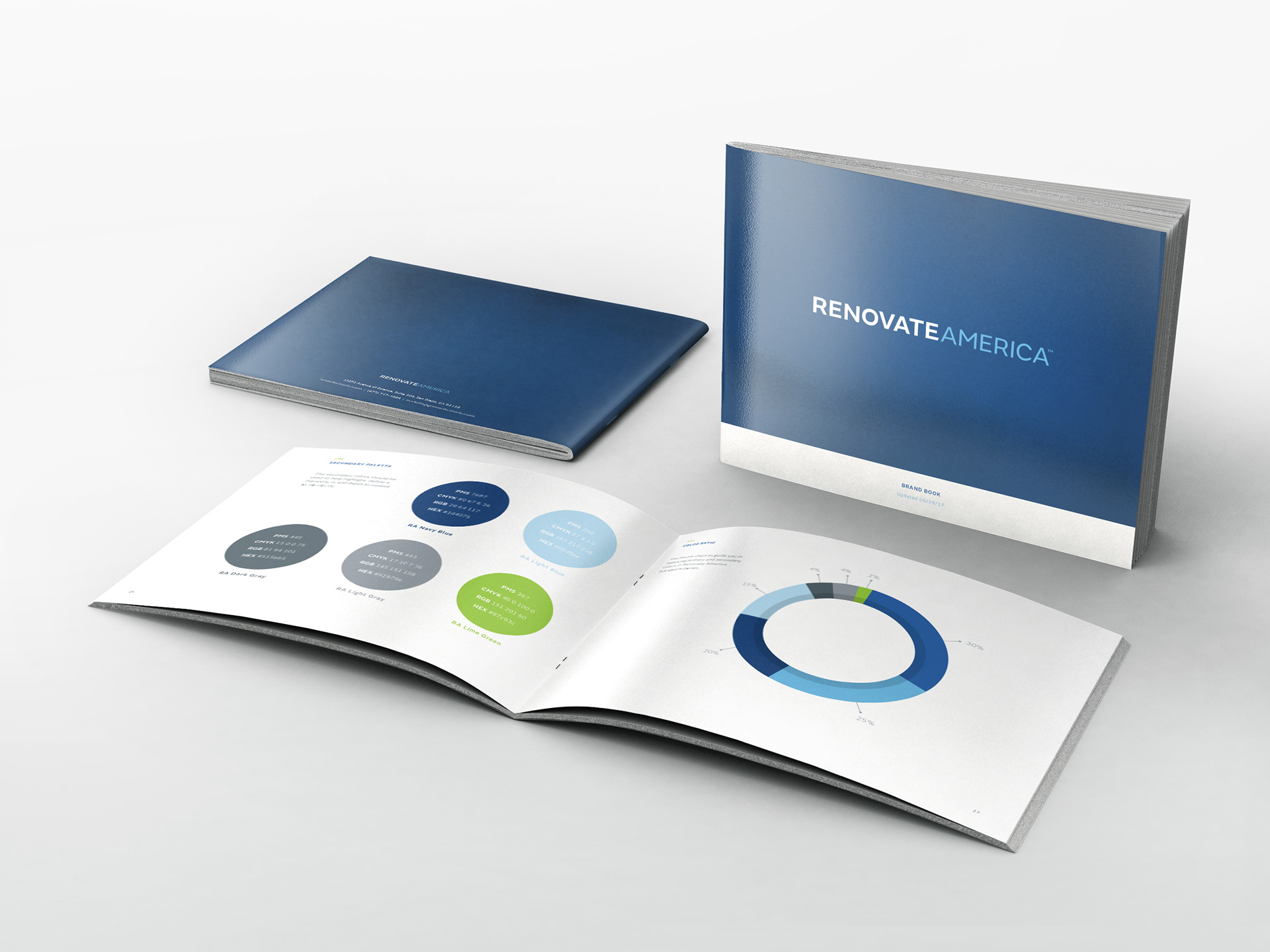
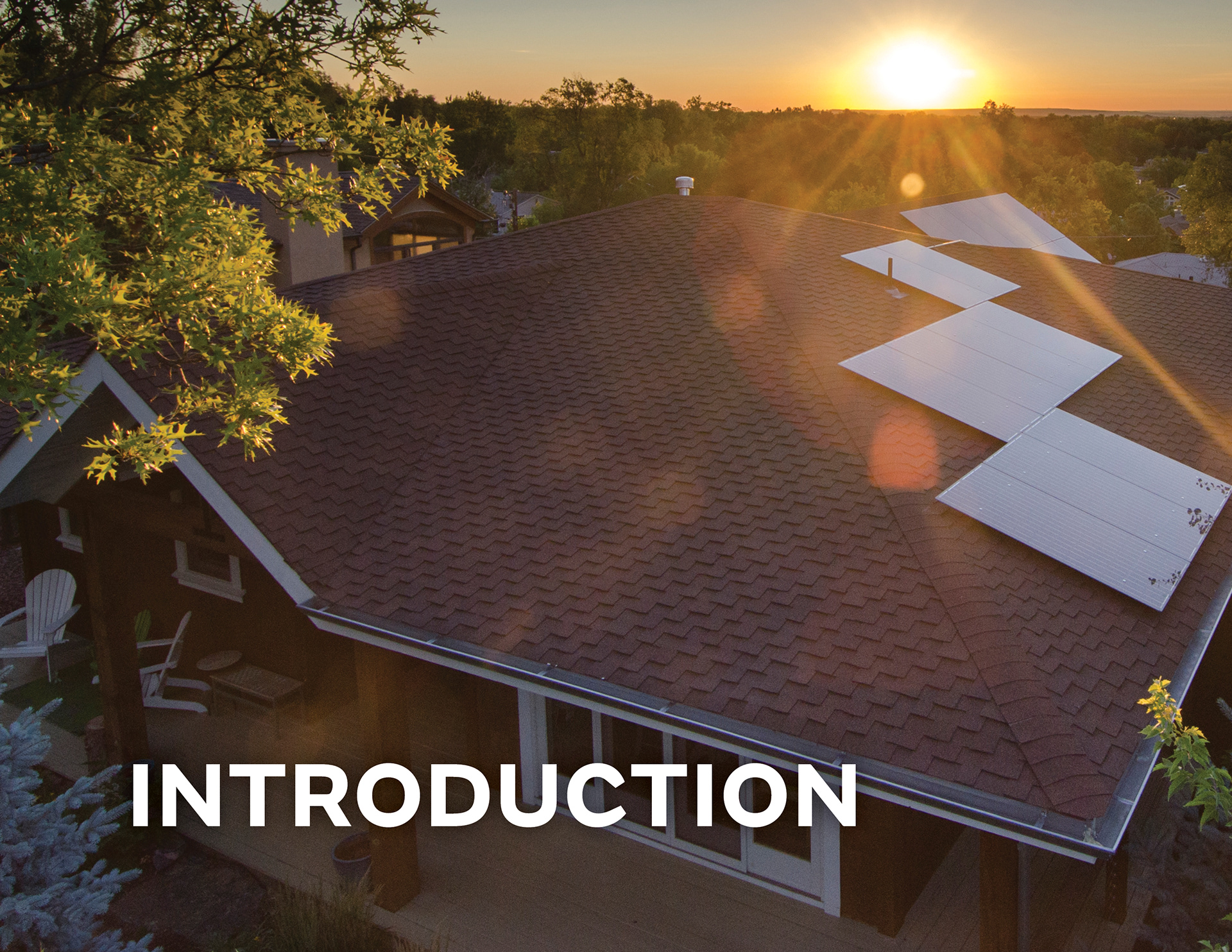
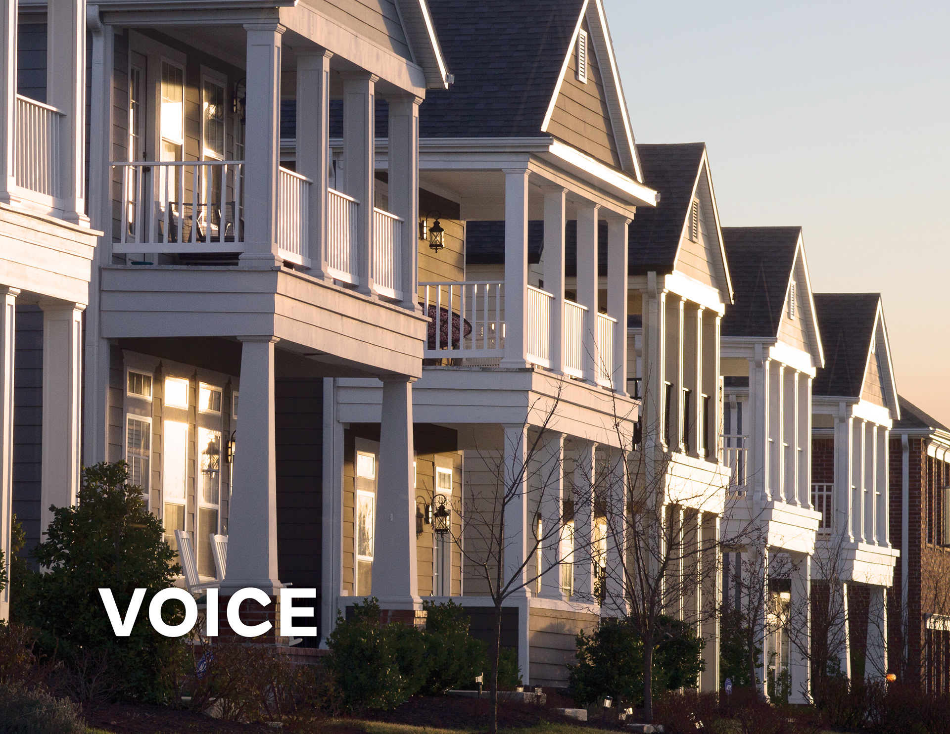
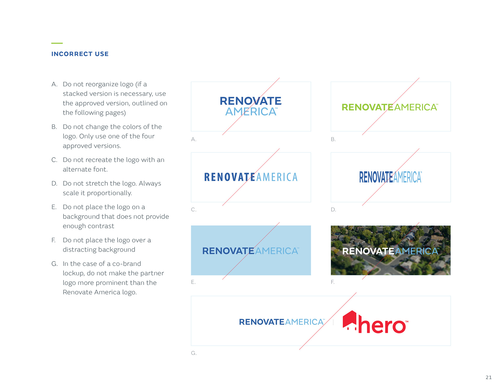
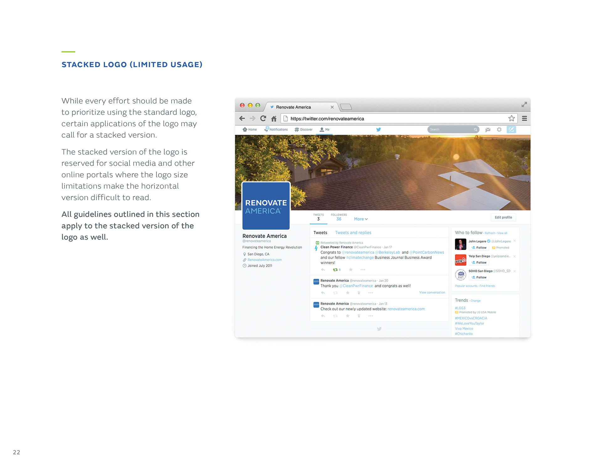
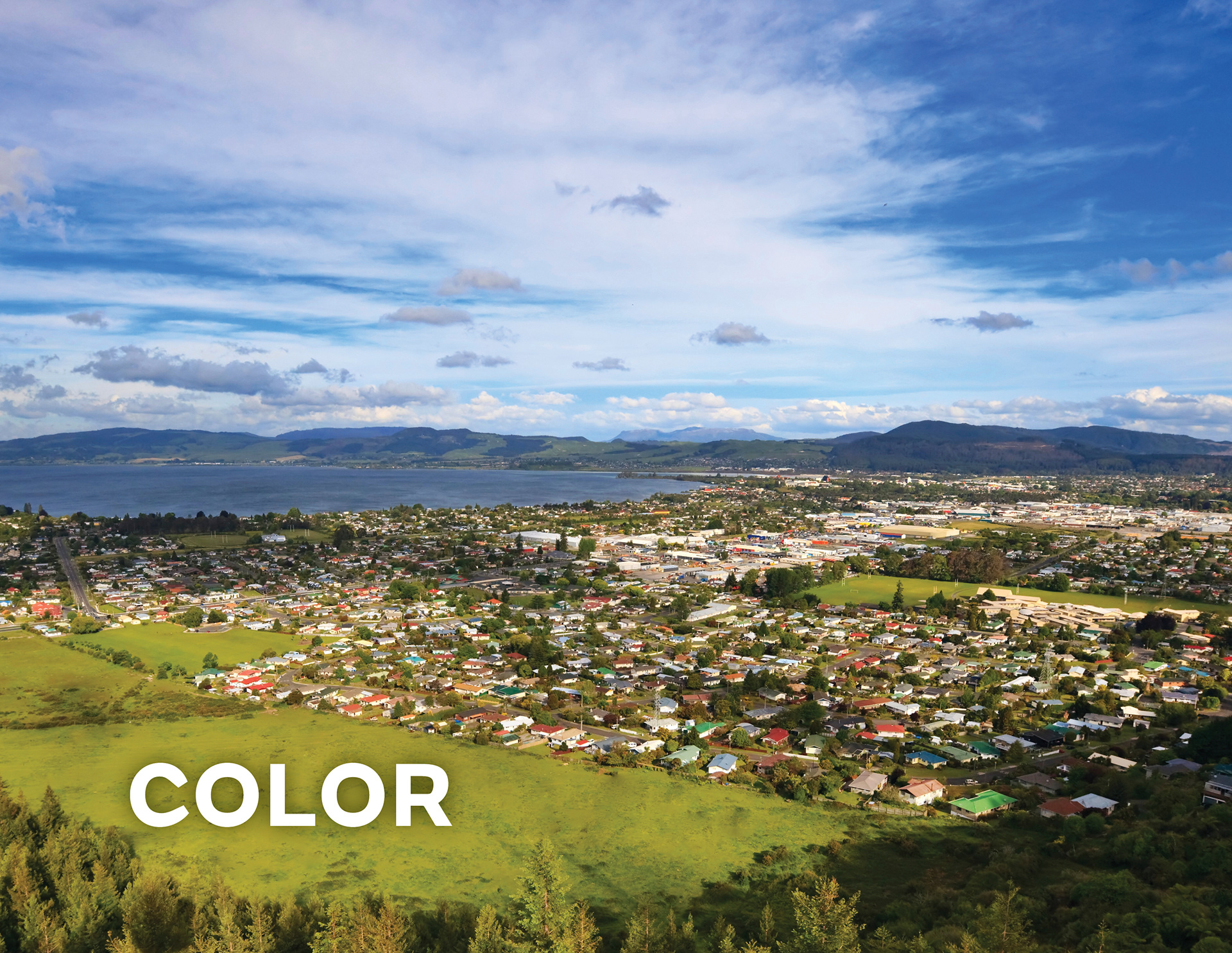
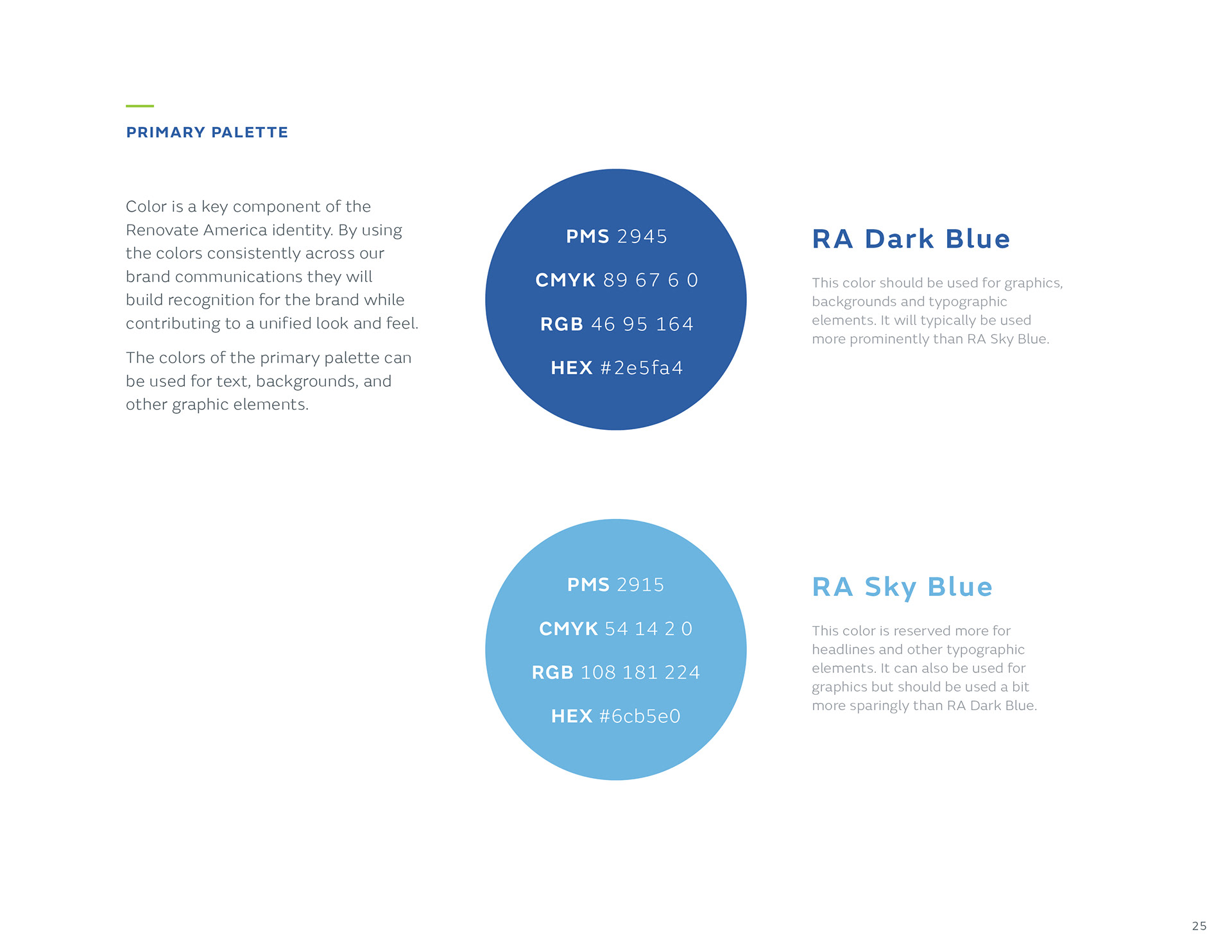
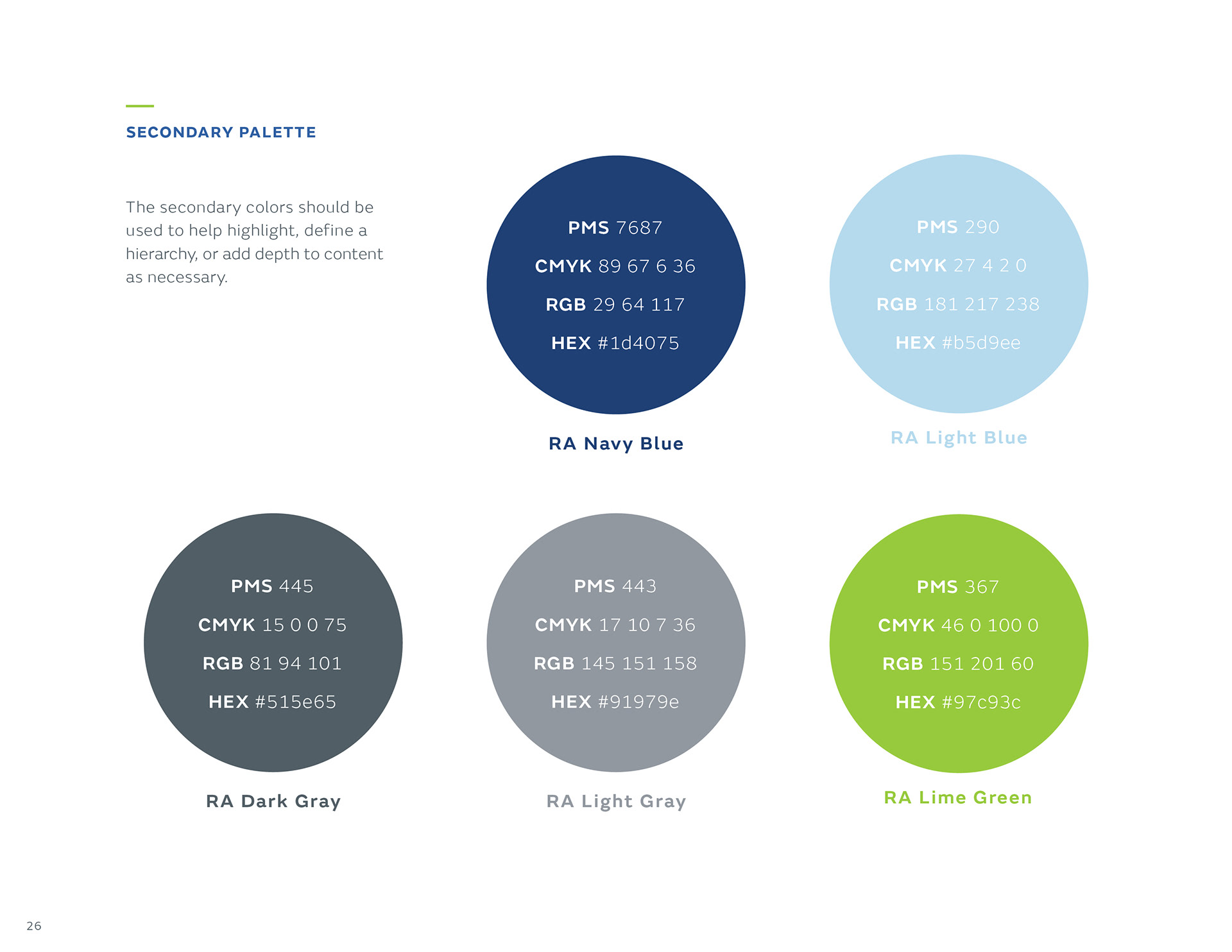
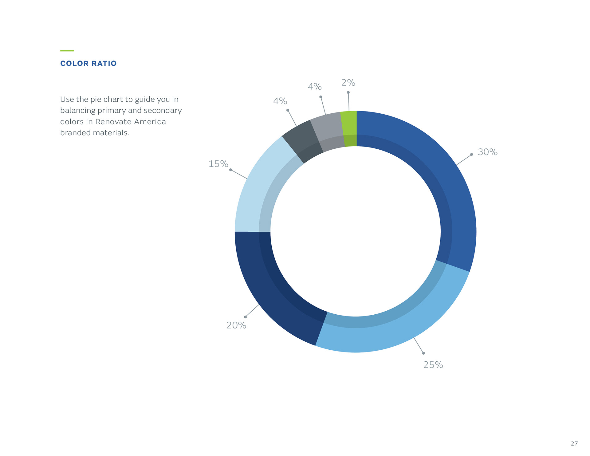
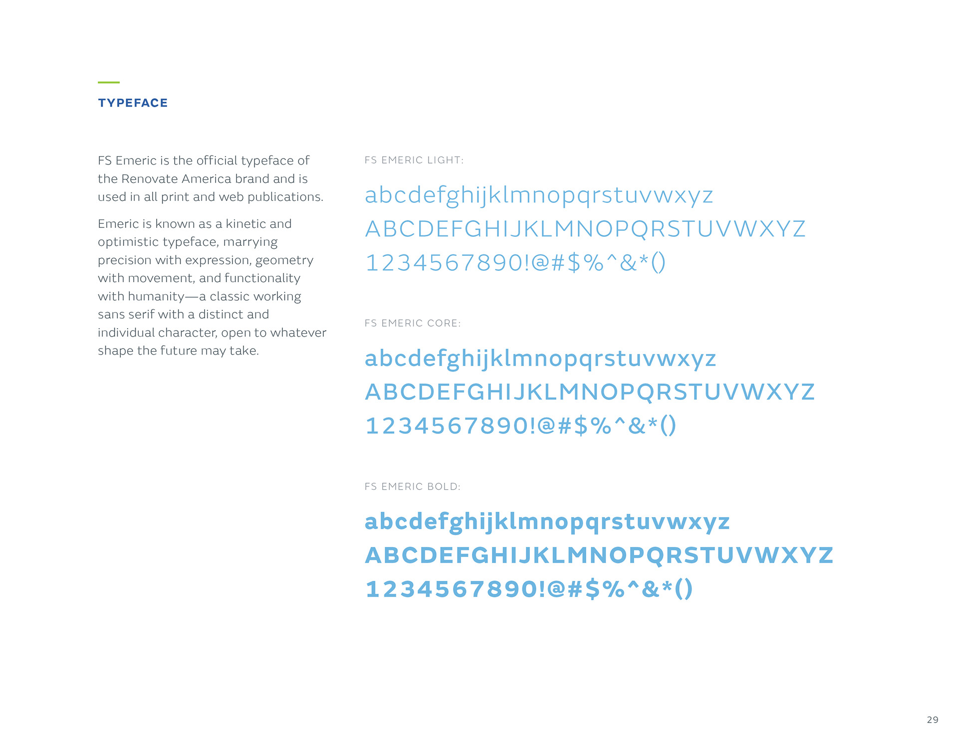
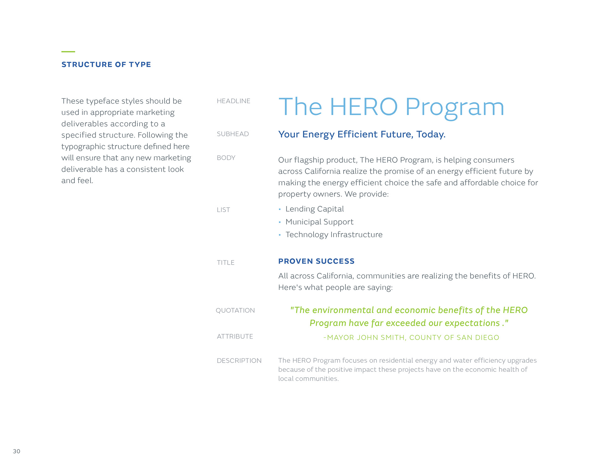
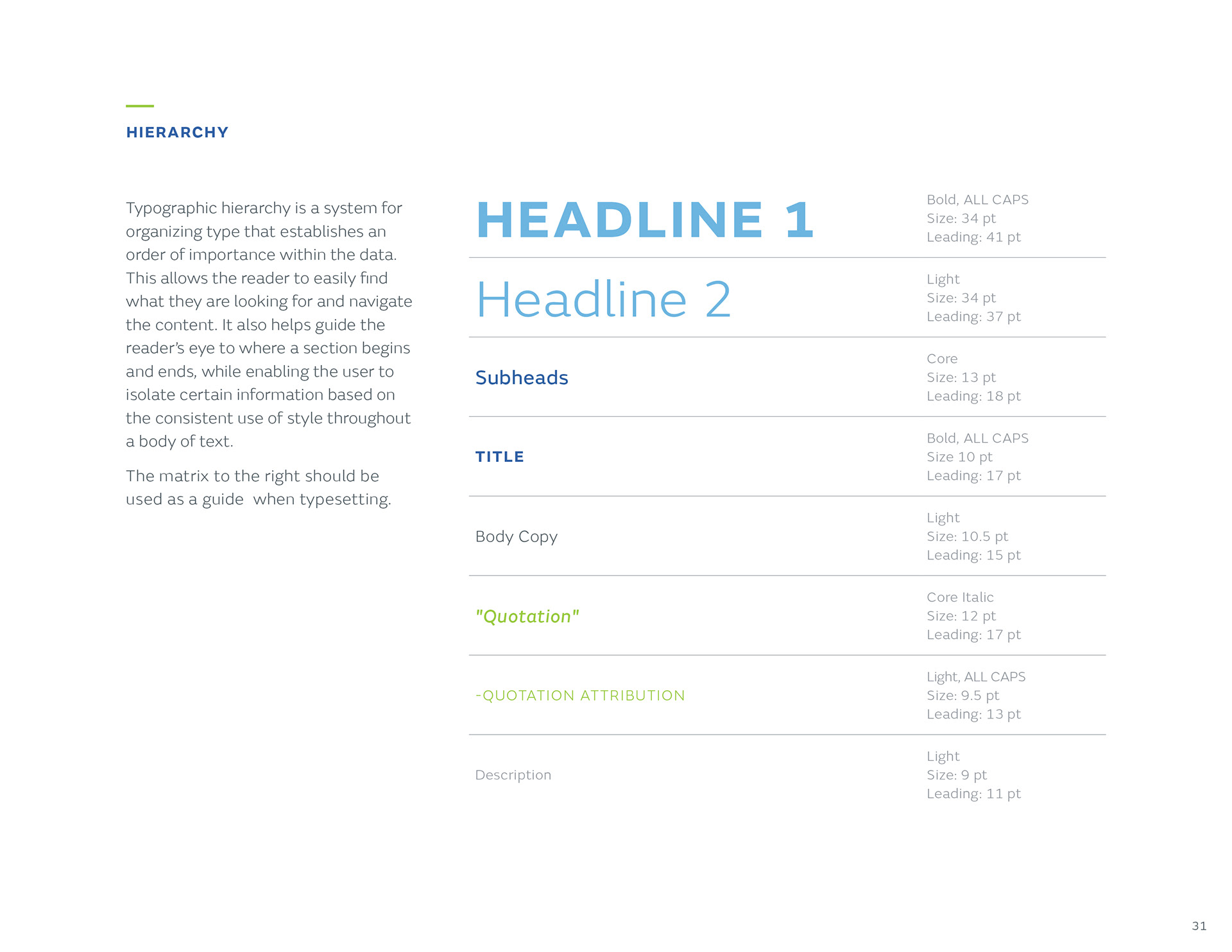
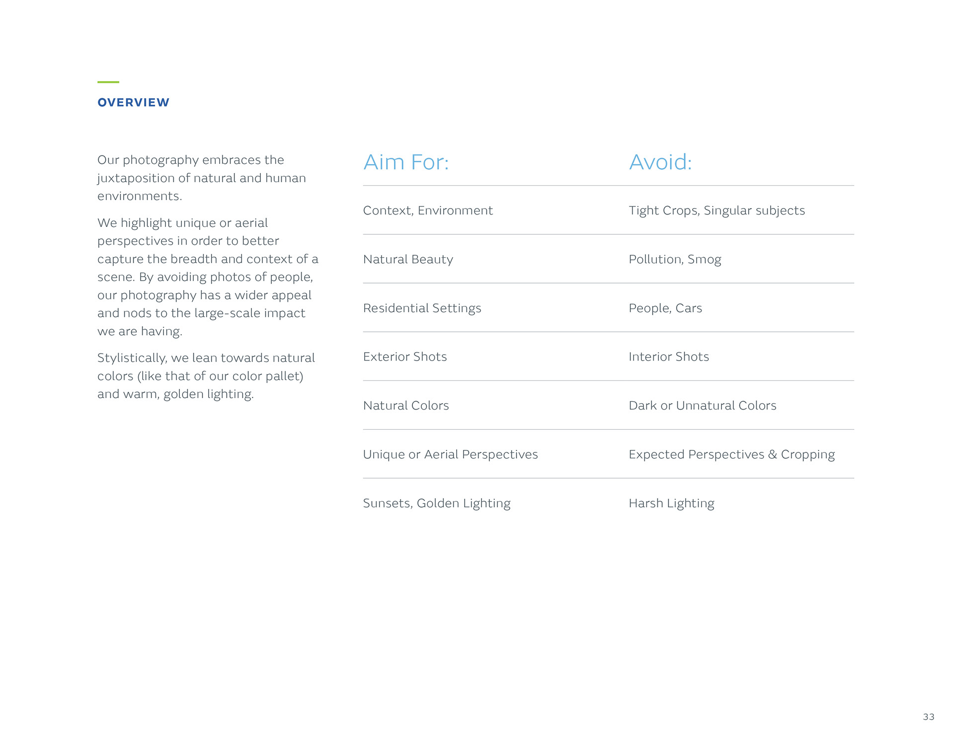
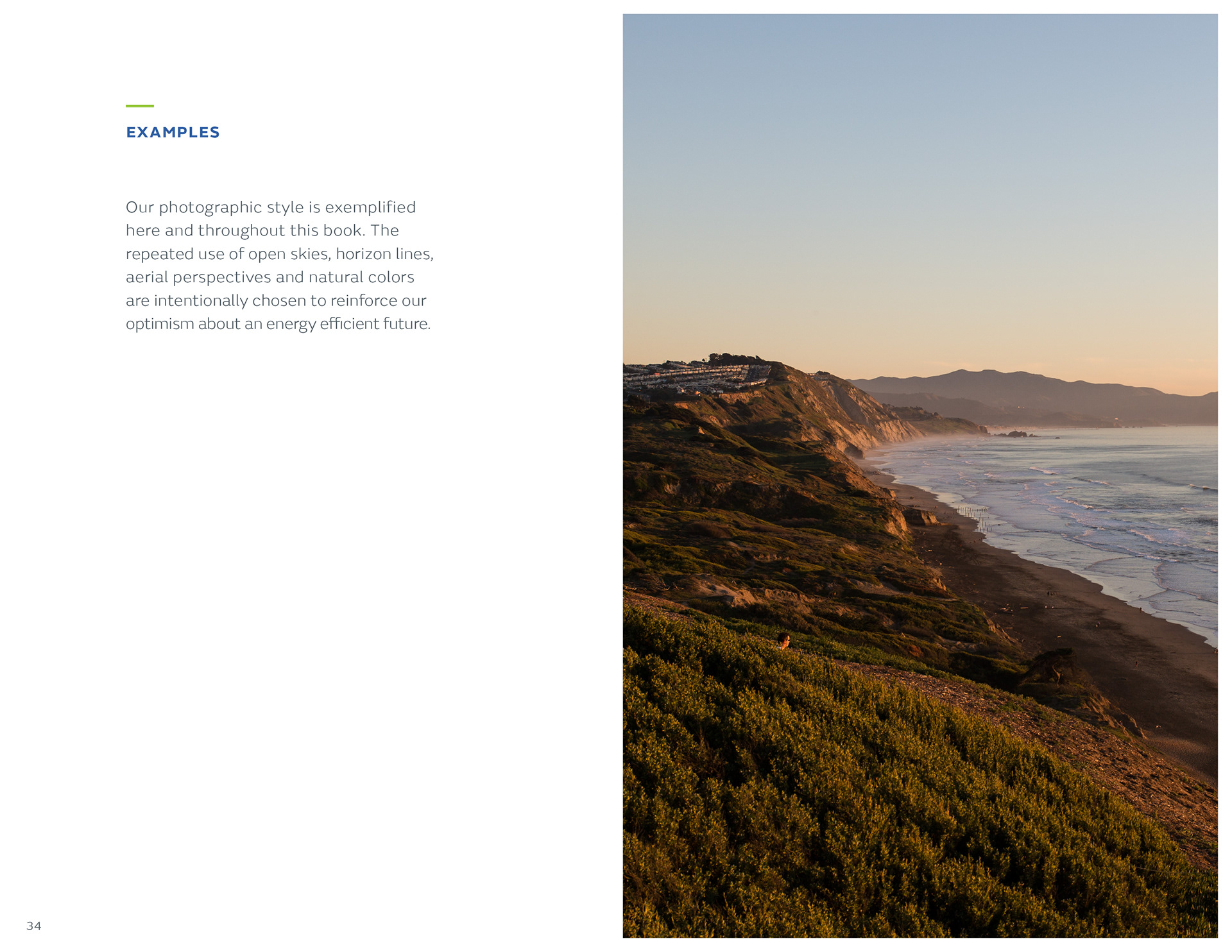
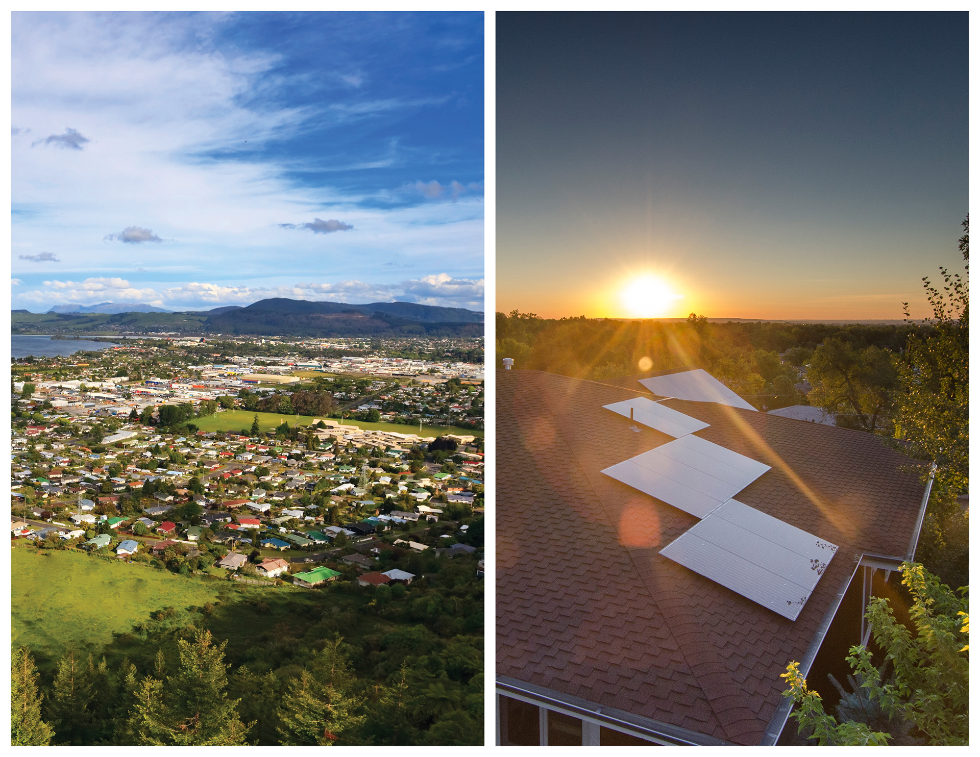
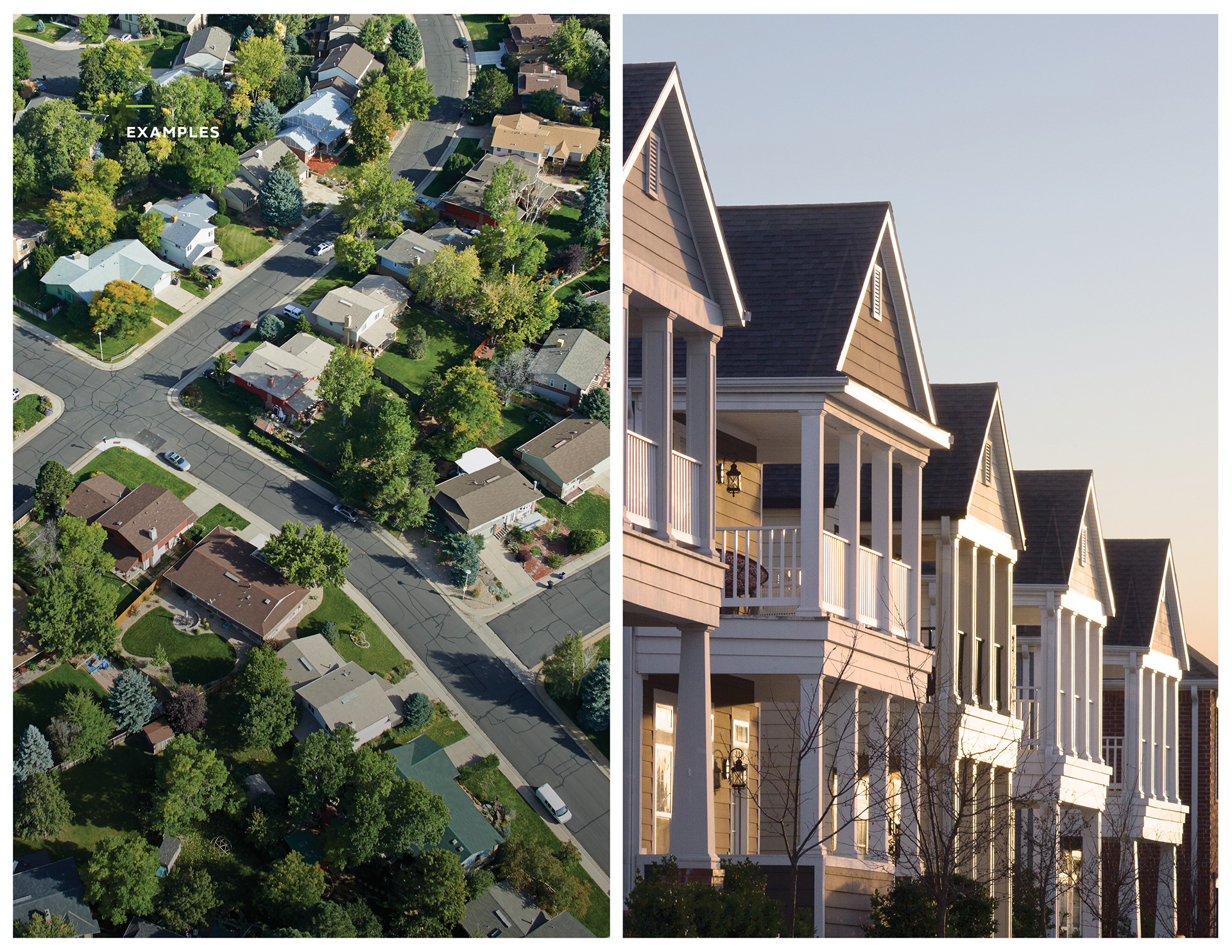
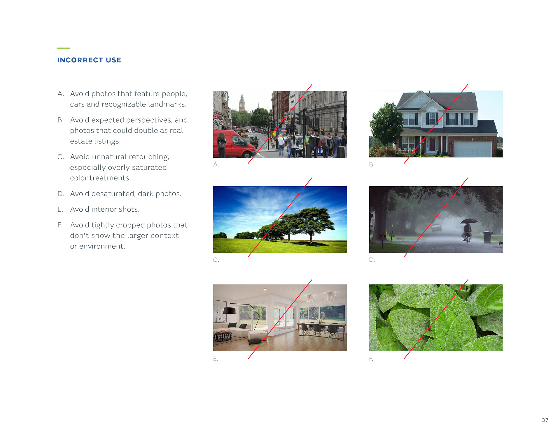
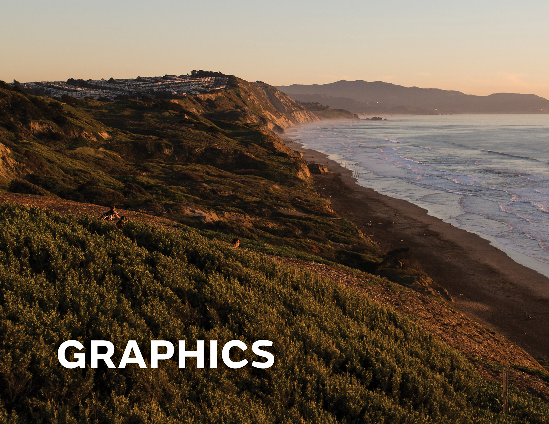
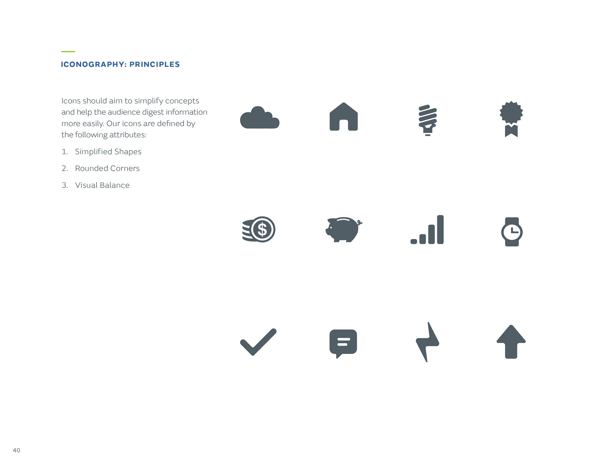
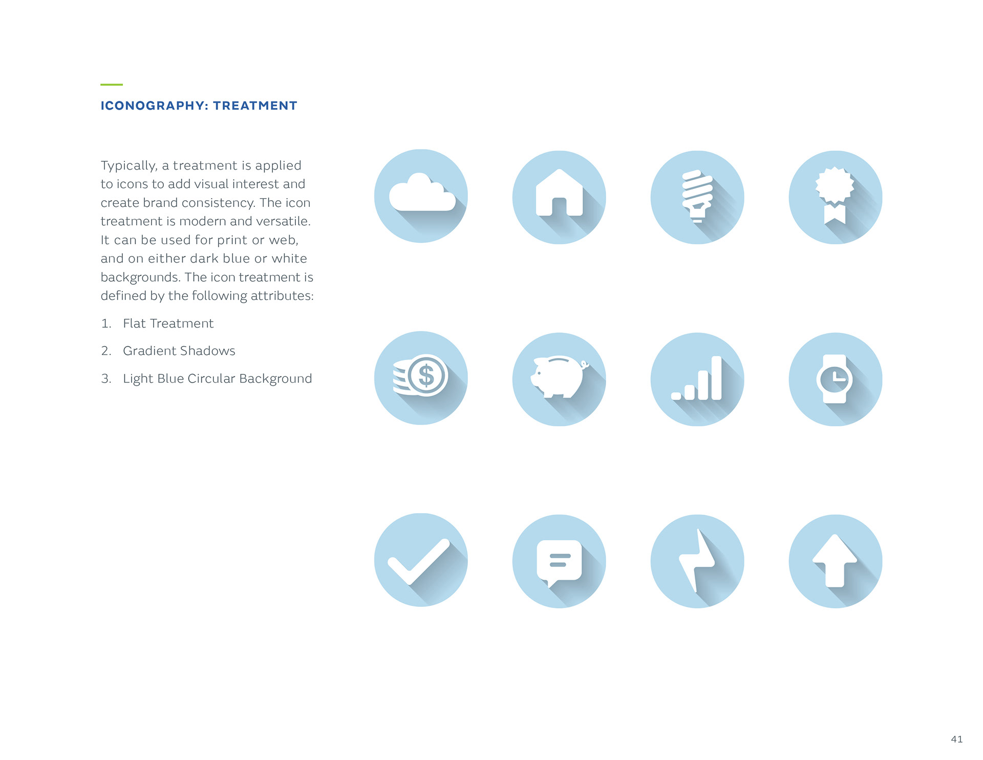
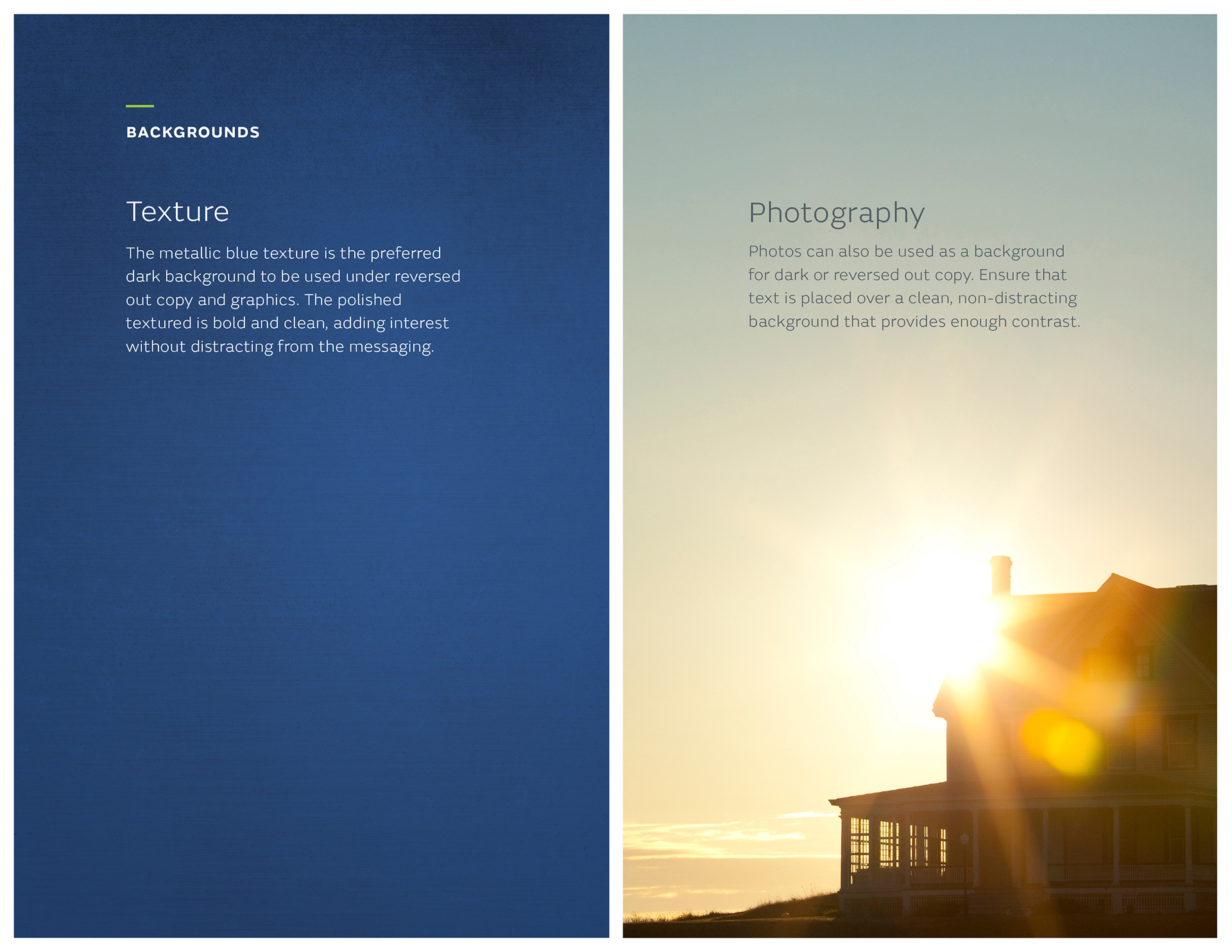
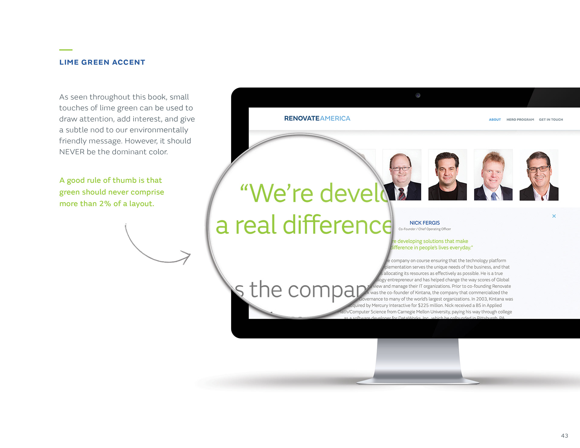
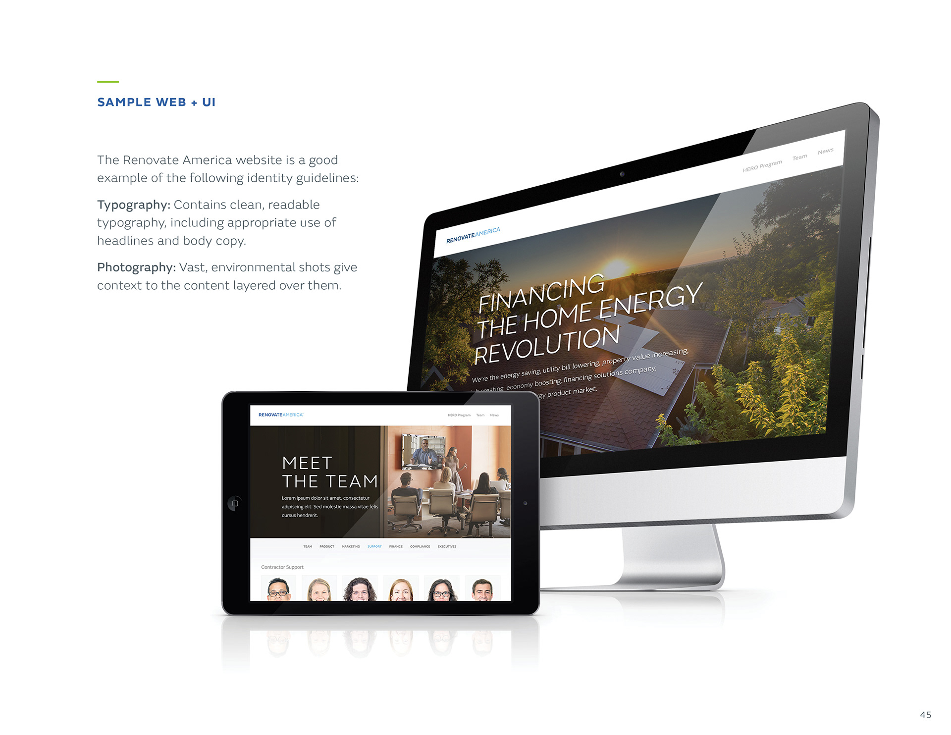
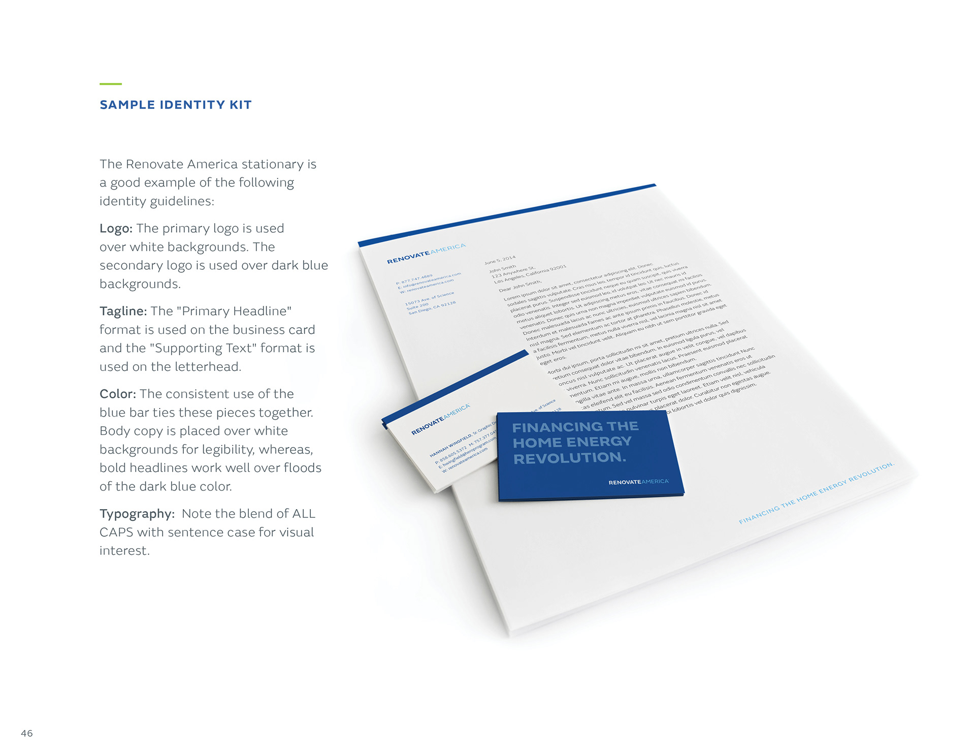
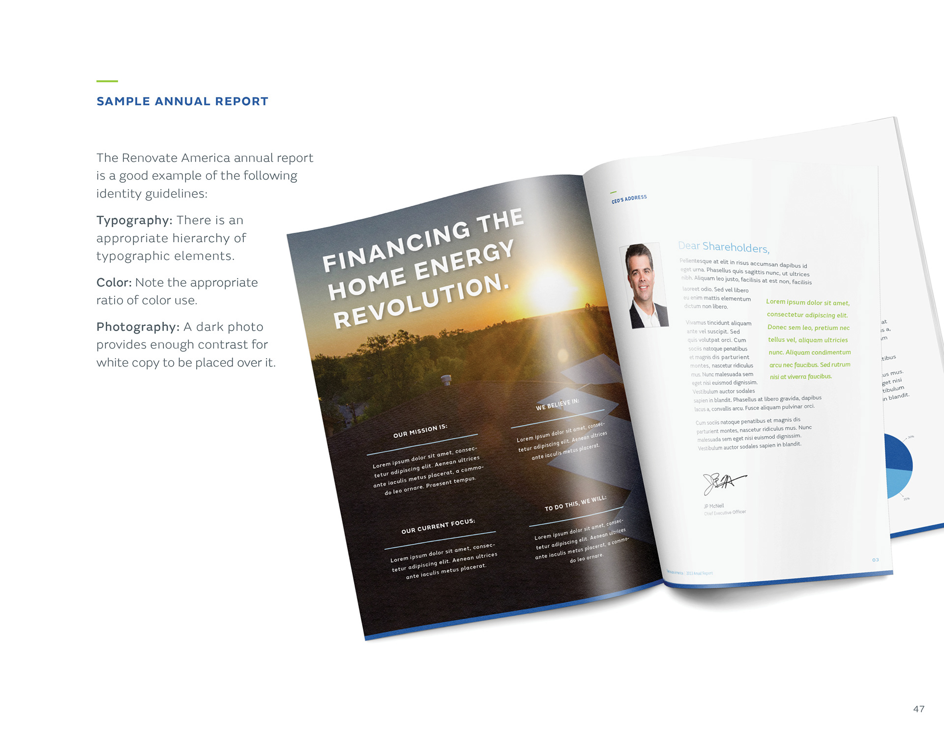
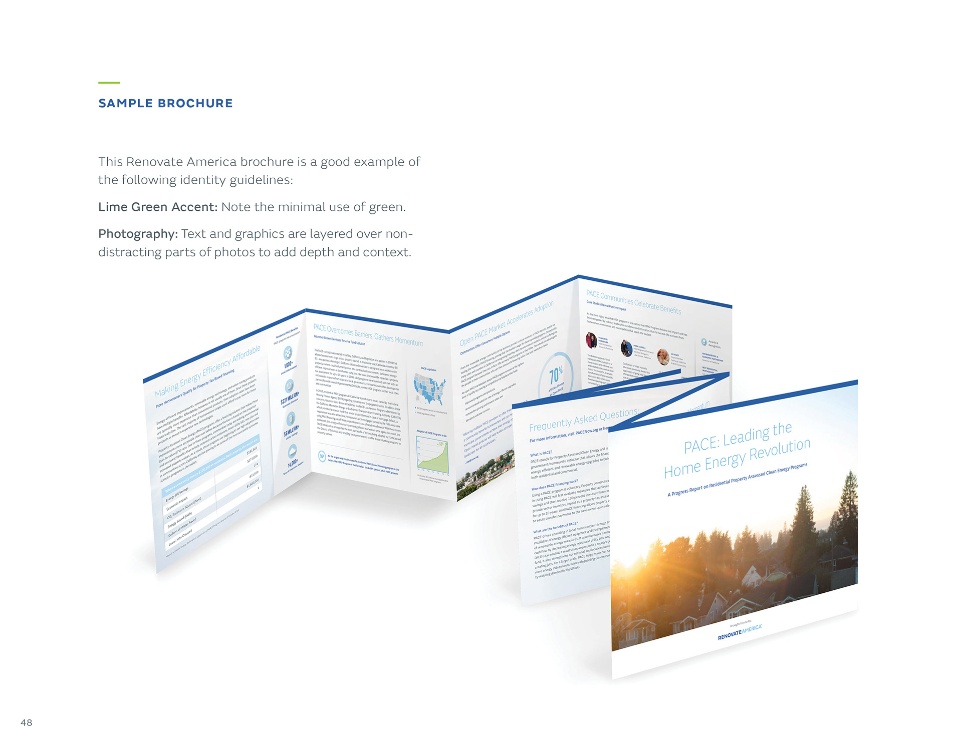
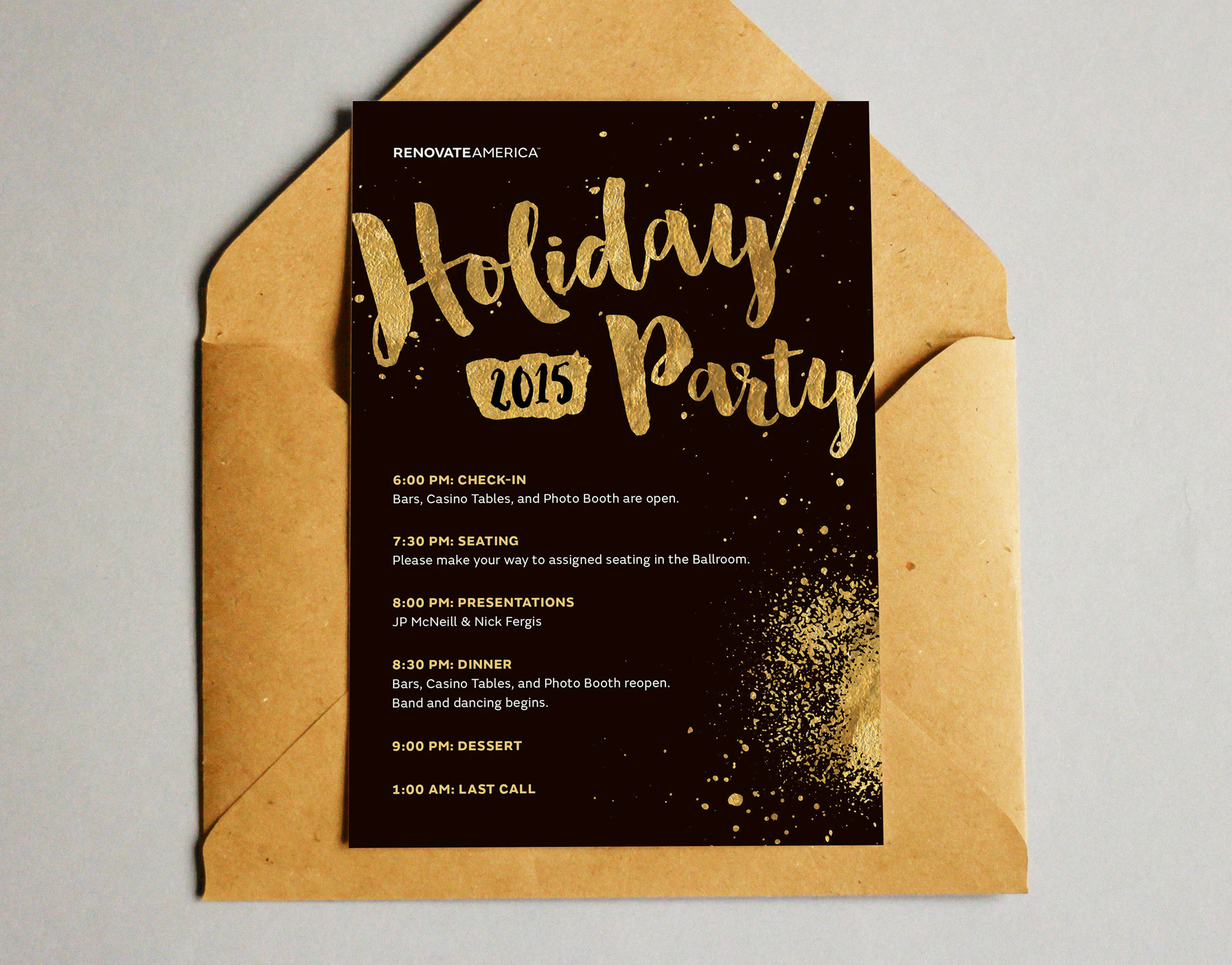
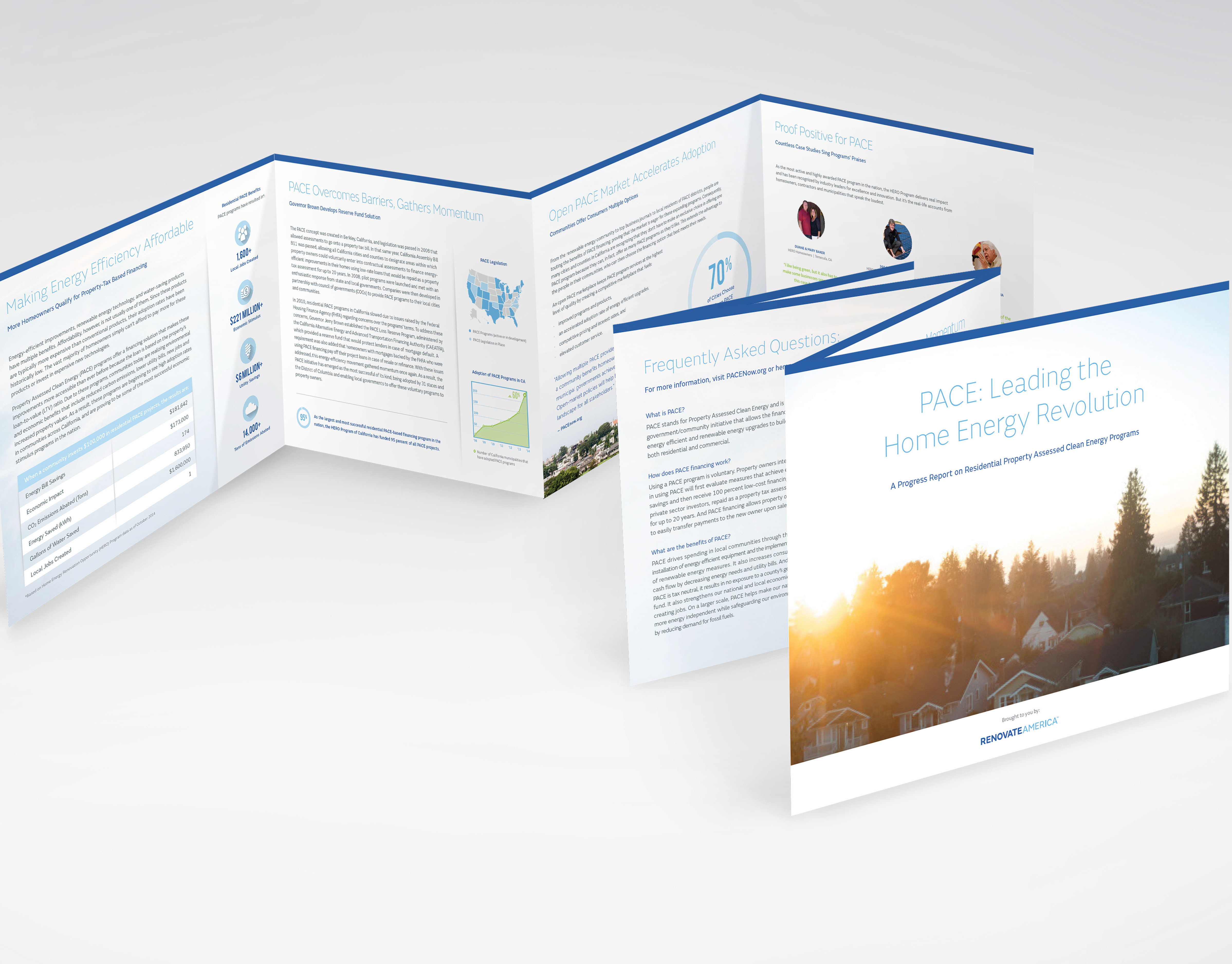
Solution: A typographic solution for the logo was the best way to accomplish this, since the brand hadn’t creatively incubated long enough to develop an all-encompassing mark. I selected a color palette that felt professional, clean and hinted at the environmental focus of the brand (with the subtle touches of green). While the color and fonts were bright and cheery, the photography felt human, optimistic and expansive. Our team struck a pleasing balance using iconography, bold color and captivating imagery to tell our story.